Lately, I’ve been so busy with a number of super creative and slightly-less-than-creative work projects for my amazing clients. It’s been a blast, and as several new projects start in the coming days, I thought it was time to give my branding a boost. Isn’t it funny how successful freelancers’ own marketing and brand needs only ever slip in when there’s a lull in the action?!
One of my favorite tasks is brand development. I enjoy it with such fervent passion, and I find it both challenging and relaxing at the same time. (It’s a paradox, much like myself. Perhaps that’s the root from which my affinity for it stems?)
In any case, I’ve recently been working on logos for several clients to help boost their new or revamped brands. Often times, I’ll create 10+ concepts before my client falls head over heels with a design, whittling through 3-4 at a clip until I nail perfection. The swooning’s wonderful for that final design, but what about the other nine who don’t make the chop?
Word to the wise: never toss a design aside. Tuck it away, yes; but never get rid of it.
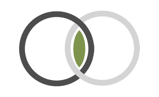
Case in point: the rings you see up by my name were a chopped element from a recent project. I fell so madly in love with them that I wound up repurposing the duo for my own branding. What do you think? There’s some deep symbolism in this little image that I wanted to share:
- I wear a silver white gold band as my wedding ring, plus a shiny hematite thumb loop to remember my journeys to date. They look just like the two bands up top.
- Right between the linked rings is a splash of green–the same hue found in the irises of my eyes! Plus, my abundant love for all things floral is tinged an herbal verdant shade, so there’s double the punch on the hue front.
- Finally, there’s a twist of symbolism in the linkage itself. The design is fluid and strong, much like my professionalism. I pride myself on going above and beyond for each and every client, and when you link in with my talents, you get 110%. Always, forever–that’s my promise.
Have a great weekend!


